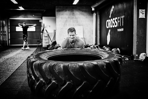
 Having professional website design is becoming increasingly important to running a business.
This notion holds true for CrossFit gyms as much as any other business, company, or restaurant. By implementing a few proven techniques, our professional WordPress website designers can improve your website, increase your online exposure, and generate more clients for your company.
While every CrossFit gym is unique, providing its own sense of community, coaches, and programs, there are key website elements that can be the difference in whether your box is successful or not. Surpisingly, many website are missing the most simple elements that provide users with basic information or allow them to contact the facility.
With extensive experience designing professional websites for CrossFit gyms, yoga studios, and fitness facilities, we have witnessed what factors help differentiate the flourishing gyms from the ones who struggle.
Below are ten tips that will help you build a better CrossFit website.

Include a “Getting Started” section.
Committing to the first CrossFit class is the hardest part of starting the journey towards physical fitness. Most prospective members looking for a new gym have likely never done CrossFit before.
As with taking on any new endeavor, this often comes with uncertainty and insecurities. Clearly outline the process of joining your CrossFit gym and explain any necessary steps.
Emphasize what you can provide as opposed to explaining CrossFit.
Customers visiting your website have most likely already heard of CrossFit and researched what is involved with the workout. It is not necessary to explain CrossFit. Having a “What is CrossFit?” page can be valuable, but many gyms make the mistake of including this information on the homepage or as the first tab on the top-level navigation bar.
Instead of explaining CrossFit, emphasize what your gym can provide members. Community, fitness, and quality coaching are three factors valued by many CrossFit members. Be sure to highlight these points on multiple occasions and specifically explain how your box can provide this.
Have a highly visible ‘Contact Us’ section.
The biggest mistake most CrossFit gyms make is not making their contact information visible. Often it is tucked away under the “About Us” section or absent from the website altogether.
Many gyms utilize a contact form and nothing more. It is important to include multiple forms of contact such as forms, phone number, email addresses, social media links and any thing else. Be sure that all email addresses and phone numbers are active and consistent across all channels. You do not want the email address on your website to be different from the email address on your Facebook page.
Utilize online scheduling software.
Online scheduling software such as MINDBODY online makes the experience more efficient for everyone involved. Users can keep track of the amount of classes they have left simply by logging in and coaches can anticipate the amount of athletes that will attend their class. Any good box values the athlete:coach ratio and online scheduling software allows you to cap classes when a certain amount of people register.
Members can save time by not driving all the way to the gym to find out that classes are full and coaches can focus more on providing proper instruction.

Optimize social media and online presence to show up locally in searches.
Having a strong social media presence is important for multiple reasons. In addition to enforcing that sense of community, an active and engaging online presence will help your box rank locally in searches.
Encourage members to join through Call-to-Action.
Visitors to your website want to know what steps are necessary to join and if they can test your gym before they sign up. Having multiple prompts and areas where prospective members can inquire about more information creates more opportunities for people to sign up.
Maximize the balance of content versus design.
Too much content can overwhelm new customers and first time visitors looking for a new gym. Conversely, investing too much in design can take away from the important information pertaining to your gym.
Work to find an efficient balance of content and graphic design. Many CrossFit gyms tend to emphasize a “hardcore” lifestyle. However, plastering your website in skulls, flames, and numerous graphics and design elements can alienate entire demographics of customers.
Be sure that your design is universally friendly and encourages all walks of life to join.
Make membership and pricing options available to clients.
One of the main factors in whether or not a client decides to join your gym is how readily available your pricing options are. If you do not provide a breakdown of membership costs on your website, there is a good chance a prospective member will search around until they find a gym that does.
It is also important to explain the pricing breakdown. Assure clients that it is more expensive than a gym membership but also more cost efficient than a personal trainer.
Include member testimonials.
Most members are proud of their CrossFit accomplishments and affiliation with their gym. Including photos and the full name of members will reassure those thinking about joining and help them relate.
Traditional testimonial quotes can appear fake and drive people away but engaging testimonials may be the difference in whether someone joins your CrossFit gym.
Optimize mobile compatibility.
An increasing number of internet users are browsing with mobile devices. Mobile browsing will soon surpass traditional desktop browsing making it more important to optimize mobile compatibility.
If your website is not enhanced with mobile website design, you could be pushing away customers forever.
Contact Ambition Insight today for more information on how to build a professional WordPress website.
For more information on CrossFit website design and professional WordPress development visit our “Contact Us” page by clicking here.

photo credit: Runar Eilertsen via photopin cc
photo credit: Runar Eilertsen via photopin cc
photo credit: greg westfall. via photopin cc
photo credit: stoermchen via photopin cc